Selecta

Delivering joy to go
  • Brand
  • Marketing
copy to clipboard

Challenge

A leader in attendant-free food and drink, Selecta had new leadership, ambitious growth plans and a transformational business strategy. There was a need to reposition and reinvent the brand: to boldly signal change and highlight it’s about so much more than food vending, to unify and support the ‘One Selecta’ strategy, to generate pride and drive change internally. Above all, to look beyond food and drink, and build the brand around what the offer really delivers to its end consumers.

Solution

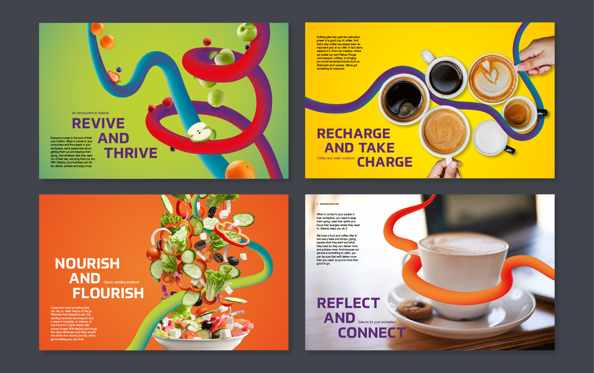
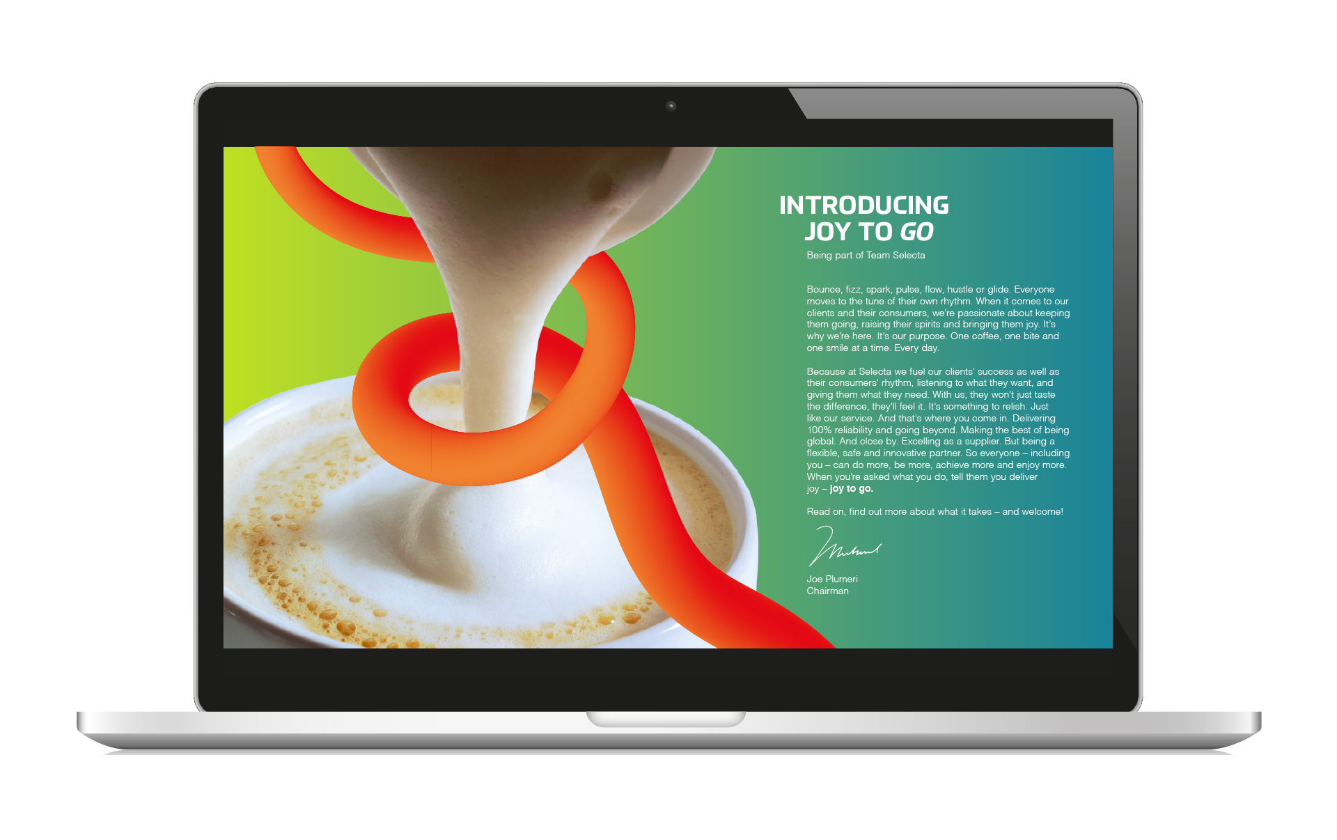
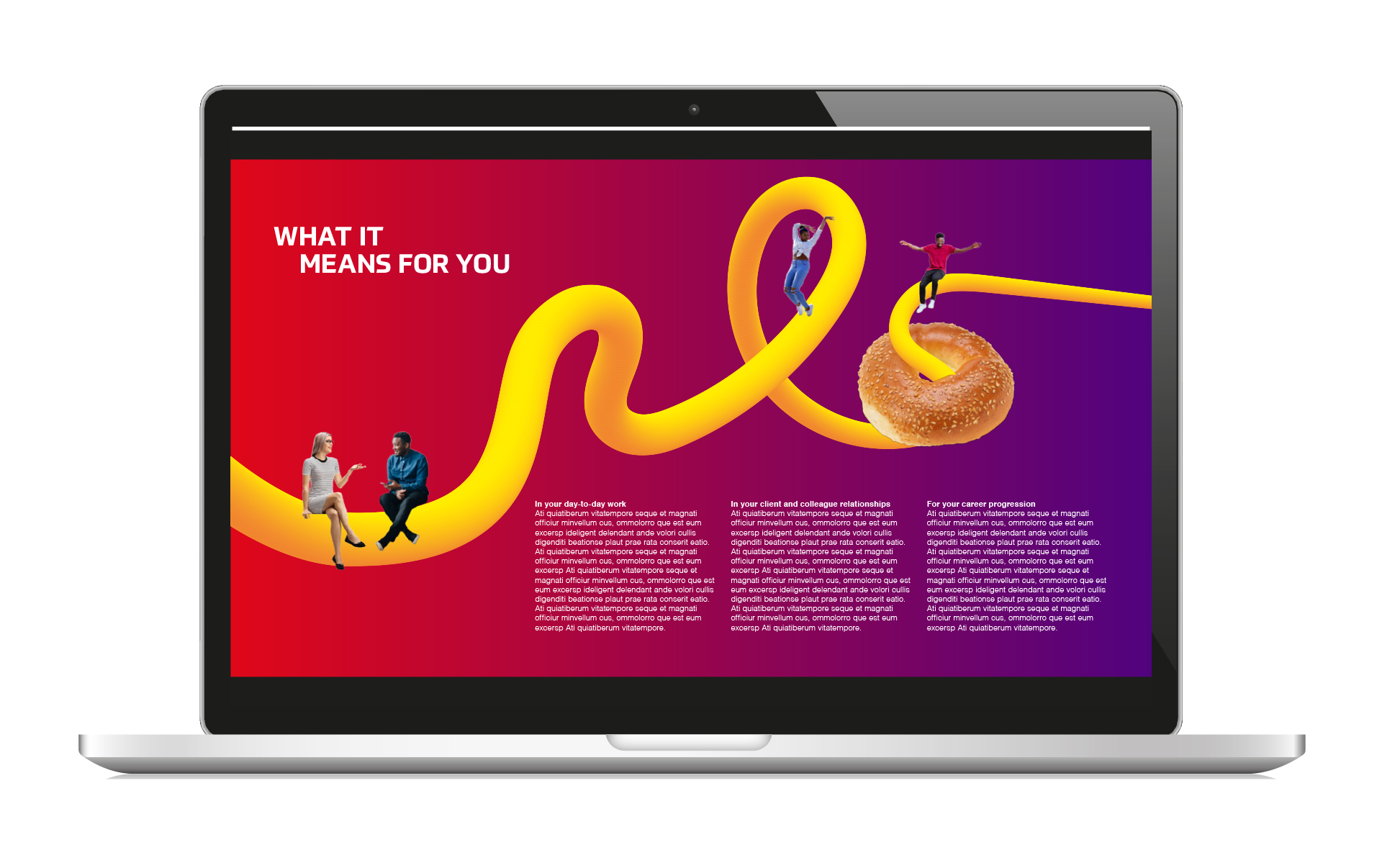
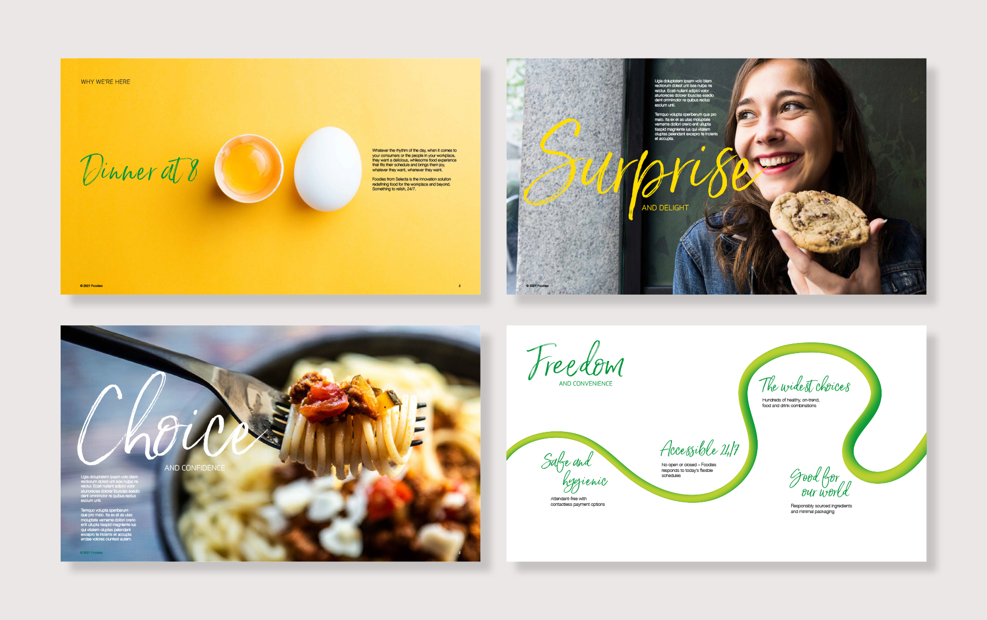
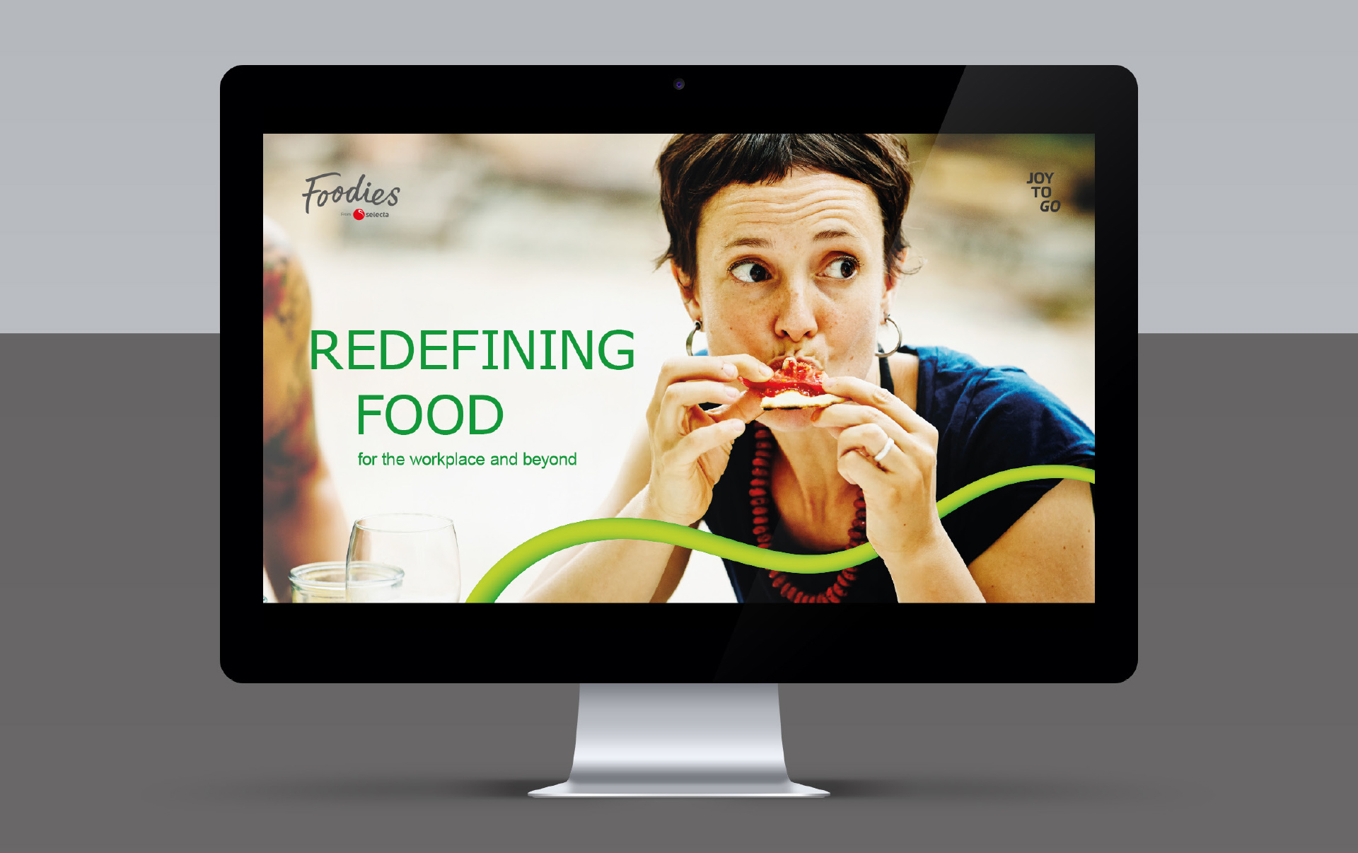
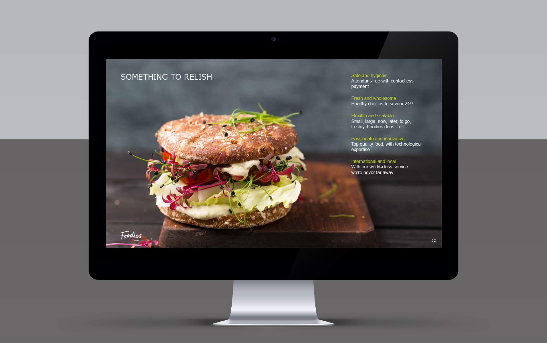
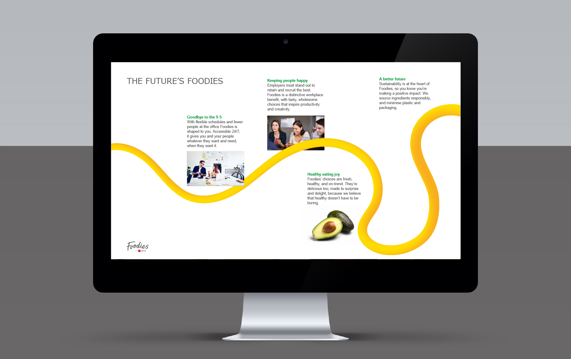
We rebuilt the brand around the uplifting ‘Joy to go’. Used as a strapline, it highlights Selecta isn’t about vending but the deep satisfaction a great ‘on the go’ food and drink solution can ultimately deliver. Though the logo remained, the visual language is loud, proud and vibrant. From the ‘joy line’ and rhythmic typography, to the warm colour palette and gradients, and imagery of ‘dancing food’ and happy people, the brand has delivered unity and transformed perceptions.


Visit the Selecta website

Deliverables

Brand
  • Brand reviews, audits and research
  • Brand positioning, narrative and messaging
  • Brand values and behaviours
  • Tone of voice
  • Brand architecture
  • Visual identity
  • Implementation, launch and roll-out planning
  • Engagement
  • Brand guidelines
  • Launch communications
Communication implementation
  • Literature and stationery
  • Presentations
  • Merchandise
  • Websites

Client feedback

Fundamental in reinventing Selecta, the repositioning has met with great enthusiasm from everyone. FB&A created a game-changing brand that’s distinctive, bold and engaging and that has met all the objectives we set out at the start of the project

Skye Sanders

Former Group Brand, Marketing & Communications Manager, Selecta

https://frankbrightabel.com/wp-content/uploads/2022/12/TheHousingNetwrok_FooterPromoImage_502x262.jpg
The Housing Network: There for you with more than a roof

We developed a proposition and brand to demonstrate the additional care and services The Housing Network provides.

https://frankbrightabel.com/wp-content/uploads/2022/05/caba_footer-promo.jpg
caba: There for the everyday and the exceptional

We developed a brand strategy and identity that reflected the human element and broadened their appeal.

Contact us

Whether you want us to be frank, bright, able or all three, get in touch.

Find out what’s new

Sign up and be first to hear about our events and publications.

Arrow Top Top