L&Q

Quality homes and better living
  • Brand
  • Communications implementation
  • Marketing
copy to clipboard

Challenge

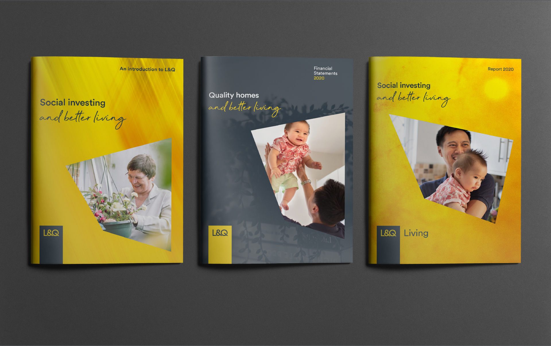
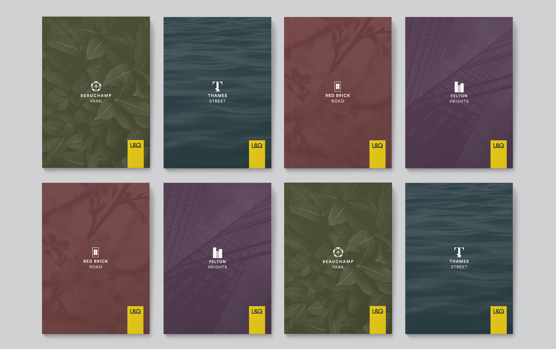
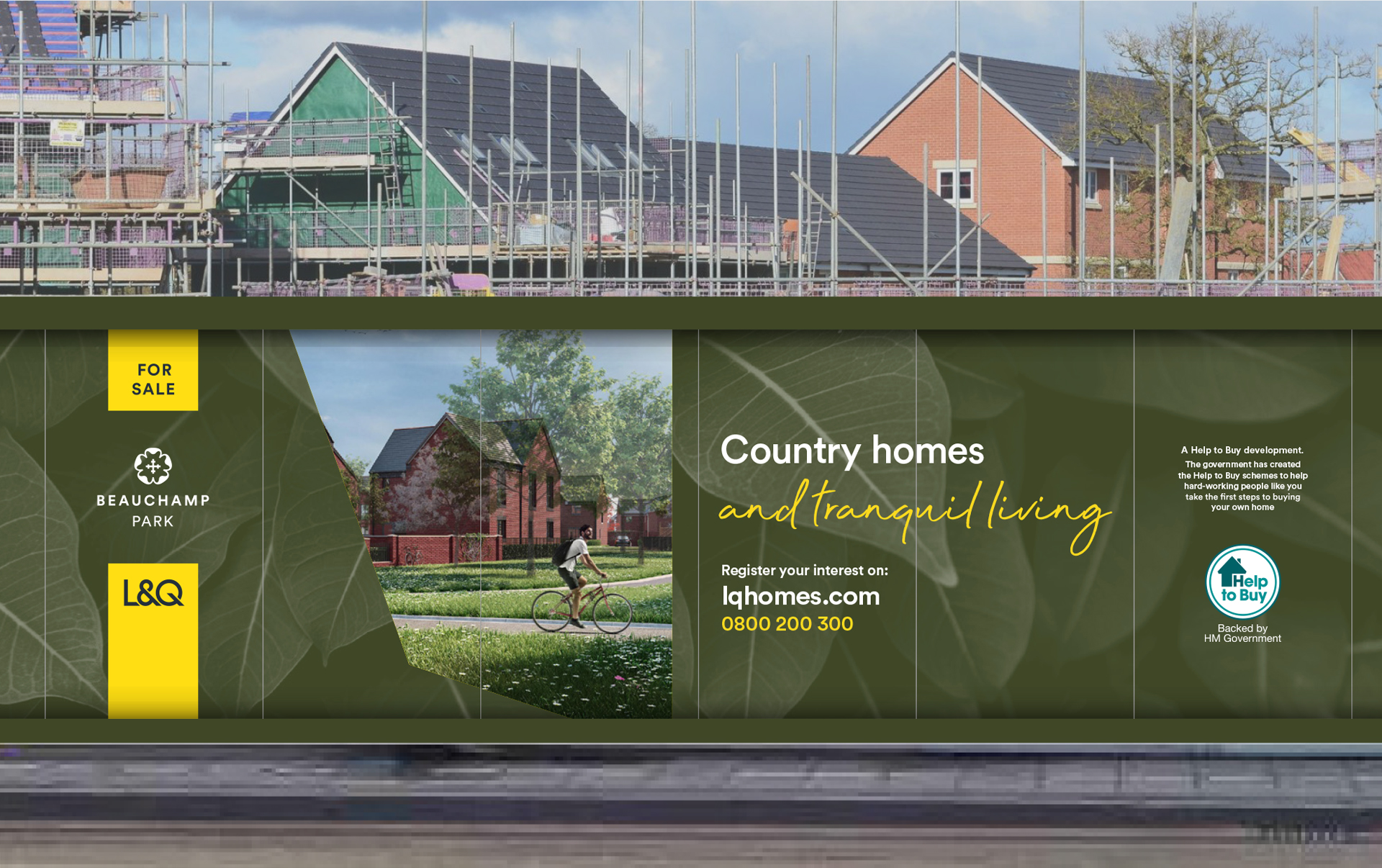
L&Q is one of the UK’s leading housing charities and developers. Their brand needs to balance commercial interests with social purpose. However, it had started to tip more towards the private commercial side and with developments creating their own communication, the essence and value of L&Q was becoming lost. We had to help the brand rediscover its purpose, express the quality of their homes and create a visual system that established a clear relationship between the core brand and development brands.

Solution

By recrafting their vision to ‘developing better ways to live through delivering better places to live’ we have shifted L&Q to a ‘better lives’ business which places their social purpose right at the heart of the brand. Couplet headline messages and two core colours convey both the functional and the emotional benefits. A dynamic shape creates a window into people’s lives and combines with rich textures to represent the quality of the homes. The master logo has been retained and placed into a quality tag to create greater prominence. Different sophisticated colour hues have been added to help add quality for marketing the development brands.

L&Q brochure images
L&Q brochure cover images
L&Q image

Deliverables

Brand
  • Brand reviews, audits and research
  • Brand positioning, narrative and messaging
  • Tone of voice
  • Visual identity
  • Implementation, launch and roll-out planning
  • Engagement
  • Brand guidelines
  • Training
Marketing
  • Campaign strategy and creation
  • Strategic marketing campaigns
  • External marketing campaigns
  • Advertising
Communication implementation
  • Literature and stationery
  • Presentations
  • Environments

Client feedback

FBA’s research and strategy was excellent. They went above and beyond and what we’ve ended up with is brilliant

Olivia Moss

Brand and strategic marketing director

https://frankbrightabel.com/wp-content/uploads/2022/12/promo-boxes-Selecta.jpg
Selecta: Delivering joy to go

We created a game-changing brand that’s distinctive, bold and engaging, built around the uplifting ‘Joy to go’.

https://frankbrightabel.com/wp-content/uploads/2022/12/TheHousingNetwrok_FooterPromoImage_502x262.jpg
The Housing Network: There for you with more than a roof

We developed a proposition and brand to demonstrate the additional care and services The Housing Network provides.

Contact us

Whether you want us to be frank, bright, able or all three, get in touch.

Find out what’s new

Sign up and be first to hear about our events and publications.

Arrow Top Top