Hollis

Being different, all together
  • Brand
  • Marketing
  • Communications implementation
copy to clipboard

Challenge

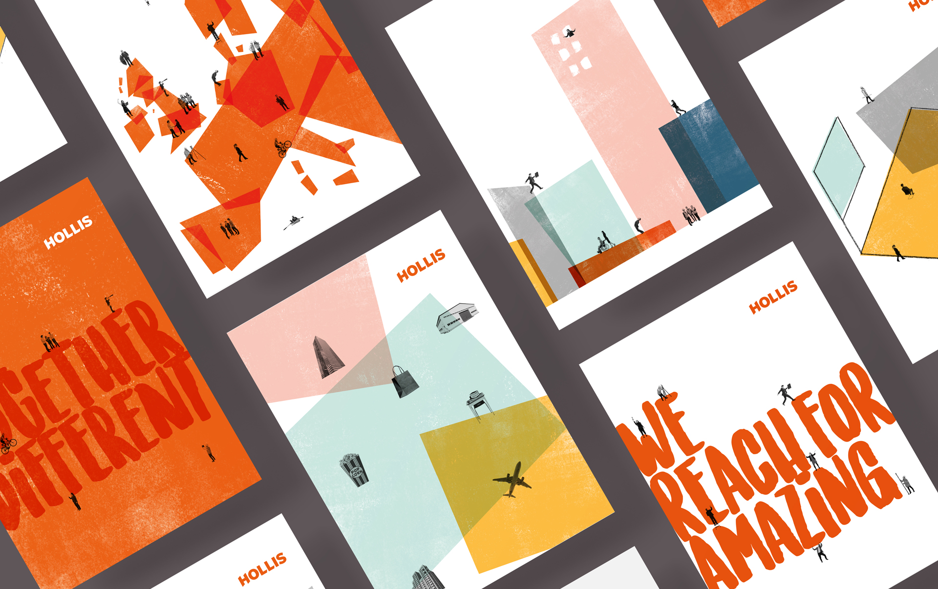
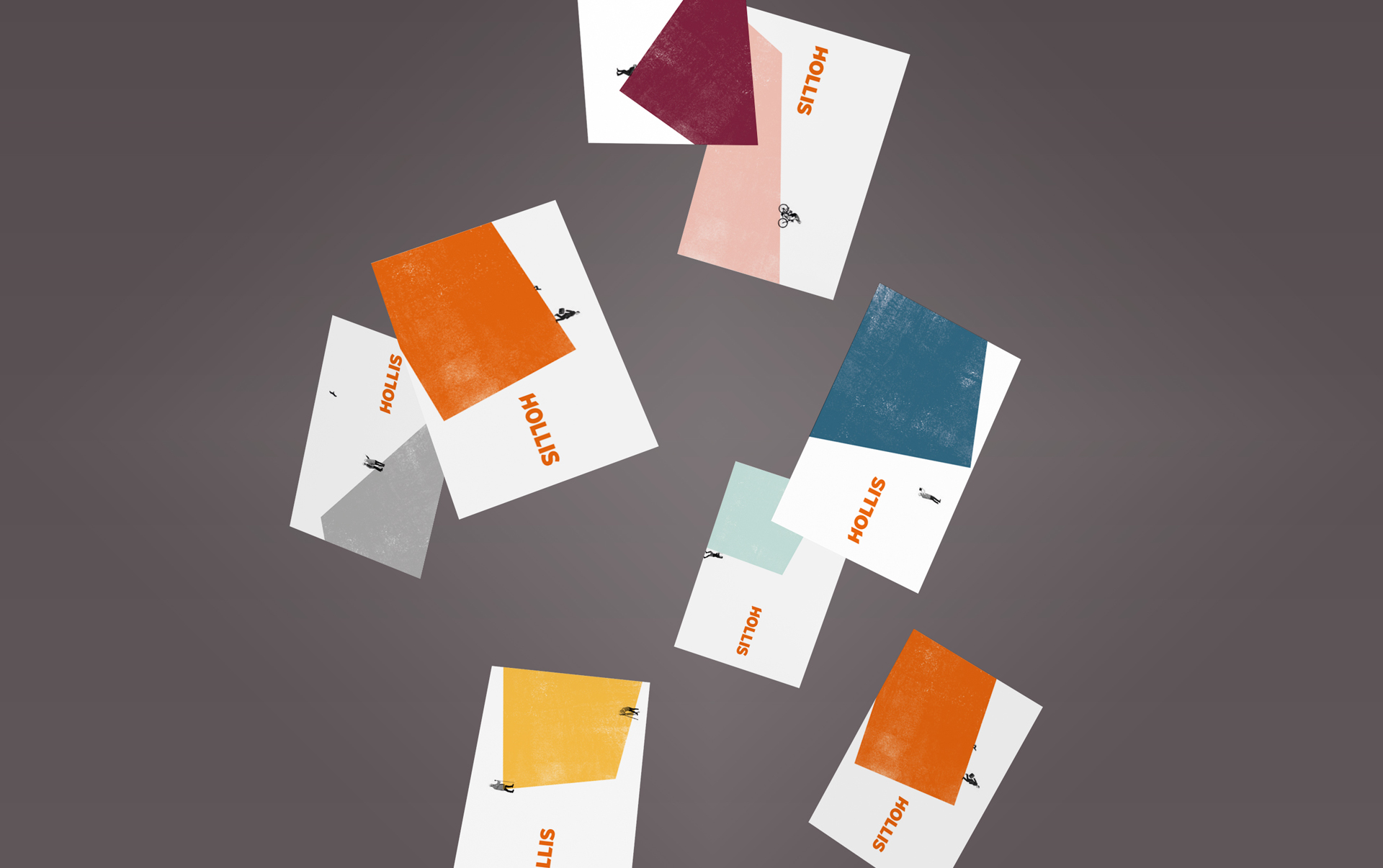
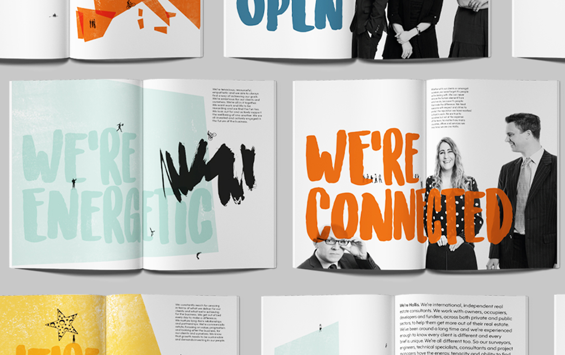
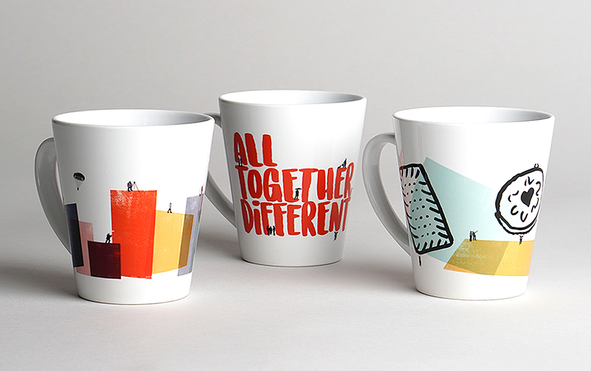
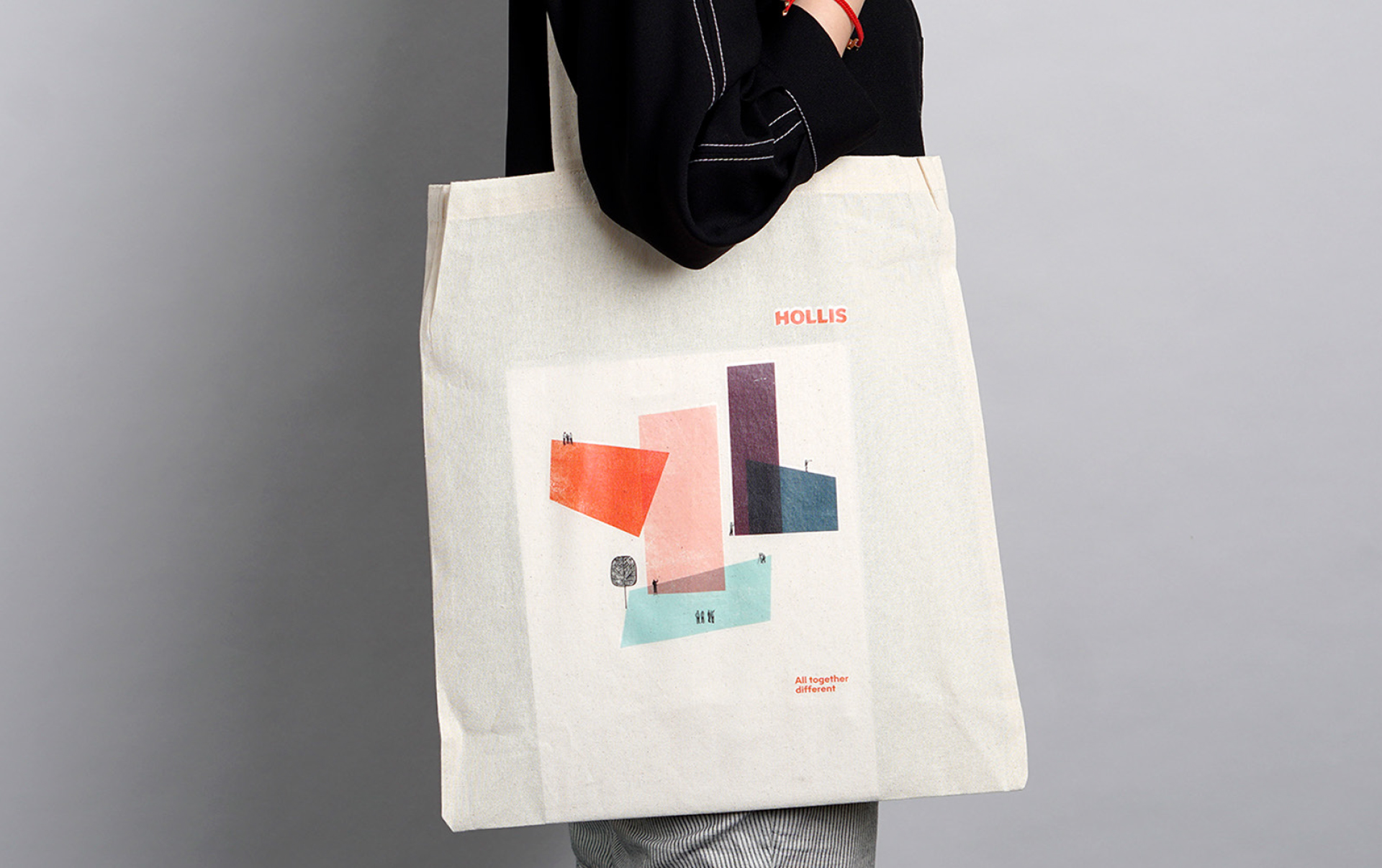
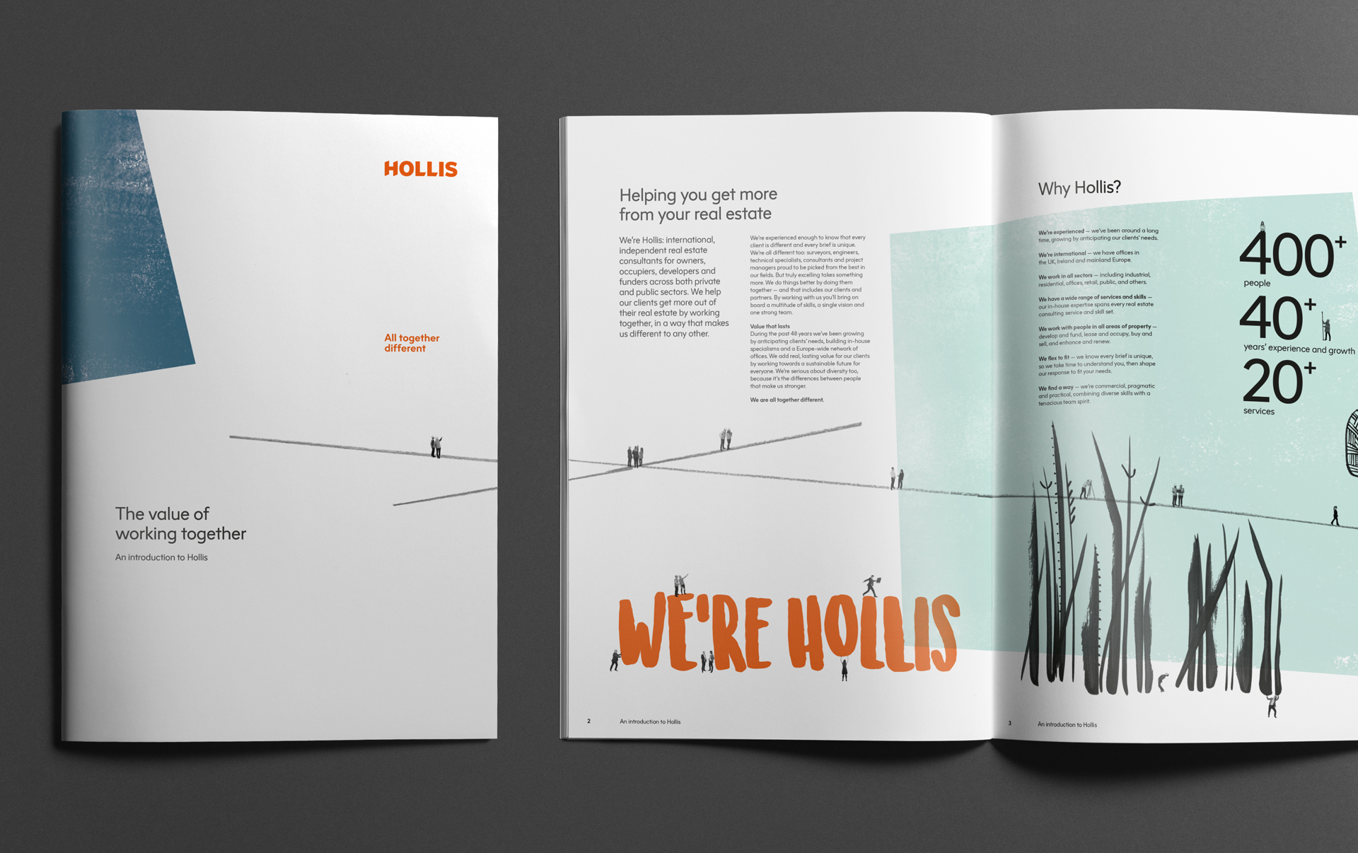
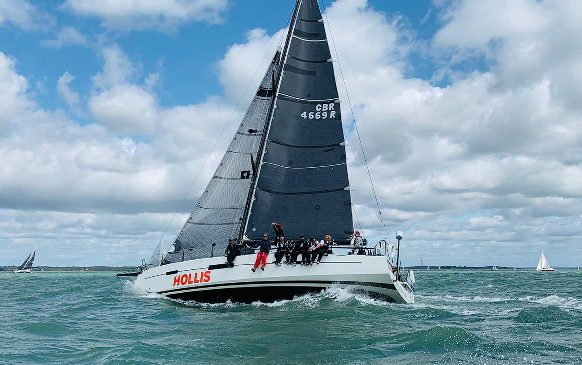
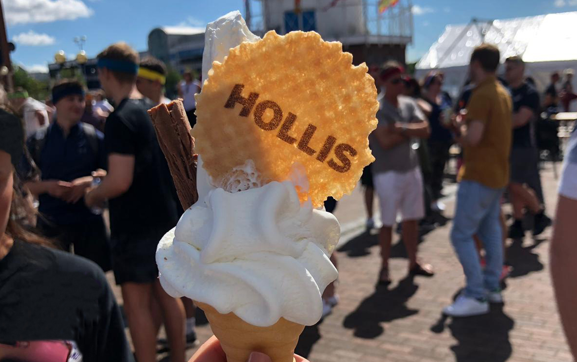
Hollis is an altogether different real estate consultancy: strong sense of self, ambition for their clients and themselves, determination to find a way and the fun, and a belief that things are done better by doing them together. The brand needed to be updated to reflect the international success they have become, but without losing themselves along the way.

Solution

We captured their collaborative and singular spirit in ‘all together different’. The visual language characterises the varied Hollis world: how they work and the impact they make within it. All this is punctuated by a logo that is as simple and bold as the real world needs it to be. How it comes together and is used is as varied and playful, human and professional as Hollis itself.


Visit the Hollis website

Hollis brand on brochure covers
Hollis brand across brochure spreads
Hollis brand internal brochure spread

Deliverables

Brand
  • Brand review, audits and research
  • Brand positioning, narrative and messaging
  • Brand values and behaviours
  • Tone of voice
  • Naming
  • Visual identity
  • Implementation, launch and roll out planning
  • Engagement
  • Brand guidelines
  • Launch communications
Marketing
  • Campaign strategy and creation
  • Strategic marketing campaign
  • Advertising
  • Digital advertising
Communications implementation
  • Literature and stationery
  • Presentations
  • Merchandise
  • Website
  • Film
  • Environments
  • Livery
  • Copywriting

Client feedback

The brand does absolutely everything we need it to. We’ve grown up, we haven’t lost our spirit of fun and nor has our brand.

Rachael Stackhouse

Brand & communications manager, Hollis

Awards

Transform Awards Europe 2020
  • Best visual identity from the property, construction and facilities management sector – Gold
  • Best implementation of a brand development project – Silver
  • Best use of copy style/ tone of voice – Silver
  • Best use of a visual property – Silver
https://frankbrightabel.com/wp-content/uploads/2022/12/promo-boxes-Selecta.jpg
Selecta: Delivering joy to go

We created a game-changing brand that’s distinctive, bold and engaging, built around the uplifting ‘Joy to go’.

https://frankbrightabel.com/wp-content/uploads/2022/12/TheHousingNetwrok_FooterPromoImage_502x262.jpg
The Housing Network: There for you with more than a roof

We developed a proposition and brand to demonstrate the additional care and services The Housing Network provides.

Contact us

Whether you want us to be frank, bright, able or all three, get in touch.

Find out what’s new

Sign up and be first to hear about our events and publications.

Arrow Top Top